ExpansionPanel
A material expansion panel. It can either be expanded or collapsed. Its body is only visible when it is expanded.
Example:
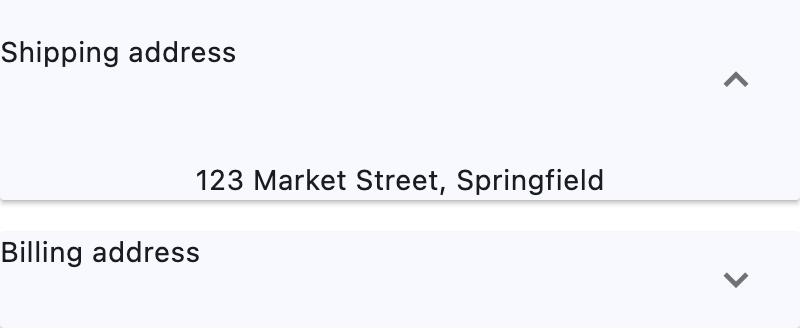
Basic ExpansionPanel
Inherits: LayoutControl, AdaptiveControl
Properties
-
bgcolor(ColorValue | None) –The background color of this panel.
-
can_tap_header(bool) –Whether tapping on this panel's
headerwill expand or collapse it. -
content(Control | None) –The control to be found in the body of this panel.
-
expanded(bool) –Whether this panel is in expanded (
True) or collapsed (False) state. -
header(Control | None) –The control to be found in the header of this panel.
-
highlight_color(ColorValue | None) –Defines the highlight color of this panel if
can_tap_headerisTrue, or the highlight color of the expand/collapseIconButtonifcan_tap_headerisFalse. -
splash_color(ColorValue | None) –Defines the splash color of this panel if
can_tap_headerisTrue, or the splash color of the expand/collapseIconButtonifcan_tap_headerisFalse.
Properties#
class-attribute
instance-attribute
#
bgcolor: ColorValue | None = None
The background color of this panel.
class-attribute
instance-attribute
#
can_tap_header: bool = False
Whether tapping on this panel's header will expand or collapse it.
class-attribute
instance-attribute
#
expanded: bool = False
Whether this panel is in expanded (True) or collapsed (False) state.
class-attribute
instance-attribute
#
header: Control | None = None
The control to be found in the header of this panel.
It is always visible, regardless of whether this panel is expanded or collapsed.
If can_tap_header is True, tapping on this header will expand or
collapse this panel.
If this property is None, this panel will have a placeholder Text as
header.
class-attribute
instance-attribute
#
highlight_color: ColorValue | None = None
Defines the highlight color of this panel if can_tap_header is True, or the highlight color of the expand/collapse IconButton if can_tap_header is False.
If this is None, then the icon button will use its default highlight color
Theme.highlight_color, and this panel will use its default highlight
color Theme.highlight_color (if can_tap_header is True).
class-attribute
instance-attribute
#
splash_color: ColorValue | None = None
Defines the splash color of this panel if can_tap_header is True, or the splash color of the expand/collapse IconButton if can_tap_header is False.
If can_tap_header is False, and Theme.use_material3 is
True, this field will be ignored, as IconButton.splash_color
will be ignored, and you should use highlight_color instead.
If this is None, then the icon button will use its default splash color
Theme.splash_color, and this panel will use its default splash color
Theme.splash_color (if can_tap_header is True).